The Business Challenge
The tools and machinery category is highly fragmented, crowded with numerous players and marked by a significant lack of visual coherence. Many brands are perceived more as commercial labels than as entities with a clear identity. Packaging is often cluttered and "loud," relying on exaggerated promises and superficial differentiation through bright colors or generic "best/strongest/premium" messaging.
The client’s hypothesis was direct and clear: Stager was not perceived as a brand in its own right, but rather as one of many names under which similar products could be found. This lack of visual and narrative differentiation contributed to stagnant turnover and made building customer loyalty a challenge.
Our goal was to reposition Stager as a trusted brand offering stable and reliable products that provide more than just a physical object—they provide continuity, support, and safety. It is a mid-to-high quality brand that avoids the "premium" trap, targeting users who value reliability over spectacle.
Branding solution
The rebranding process began with a subtle but essential shift in perspective: Stager is not just about the products, but about the long-term relationship with them. Integrated services—spare parts, repairs, constant availability—become real differentiators with strategic brand value.
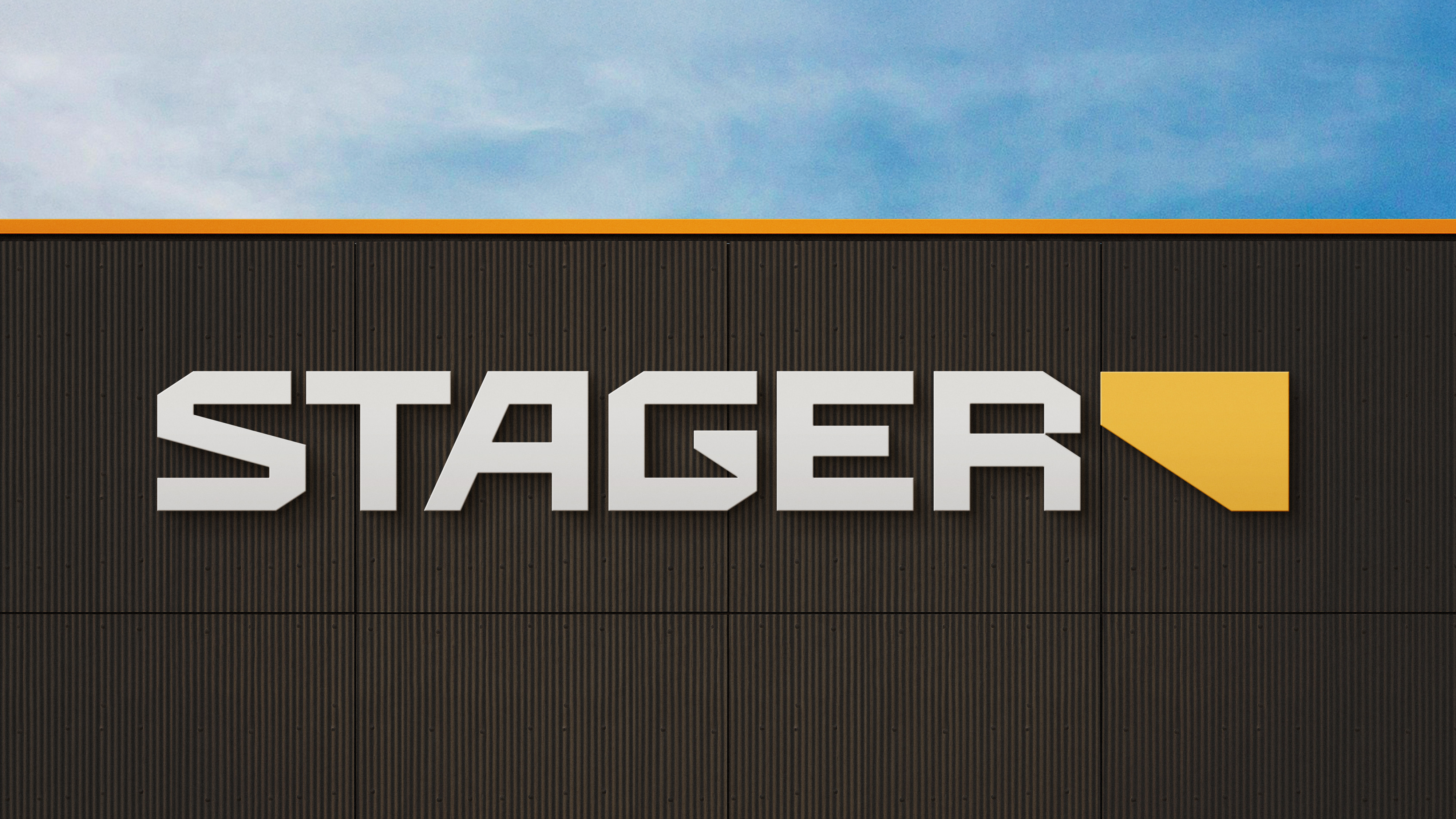
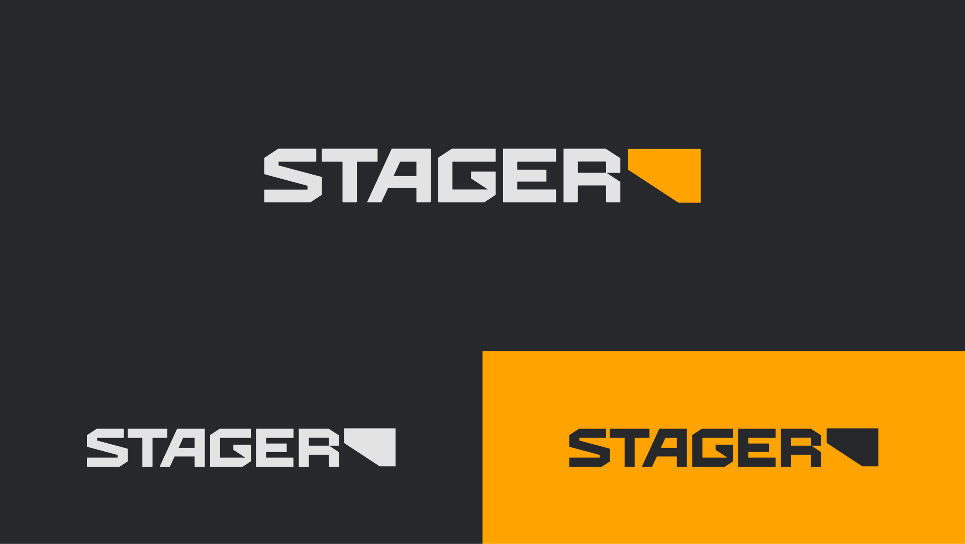
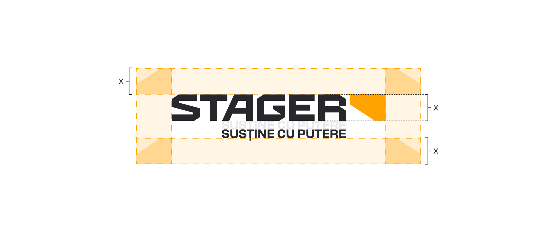
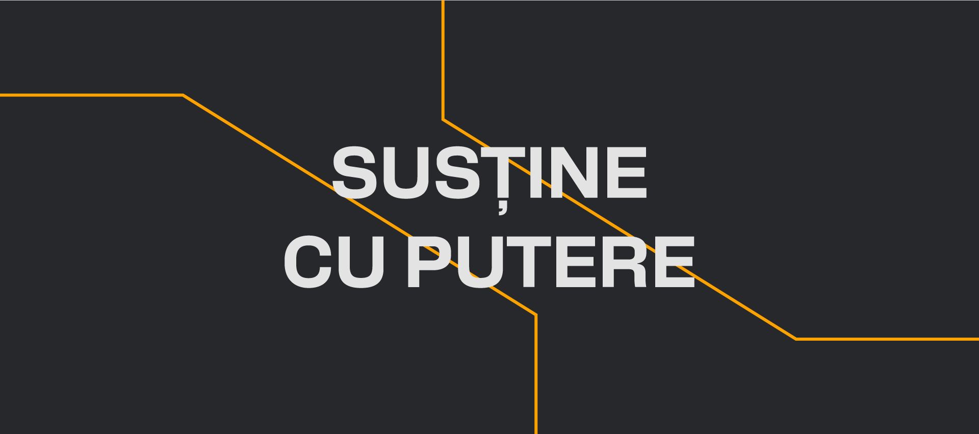
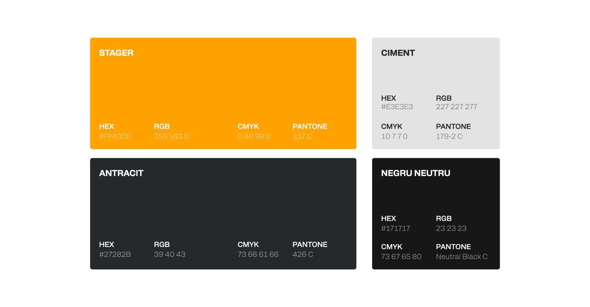
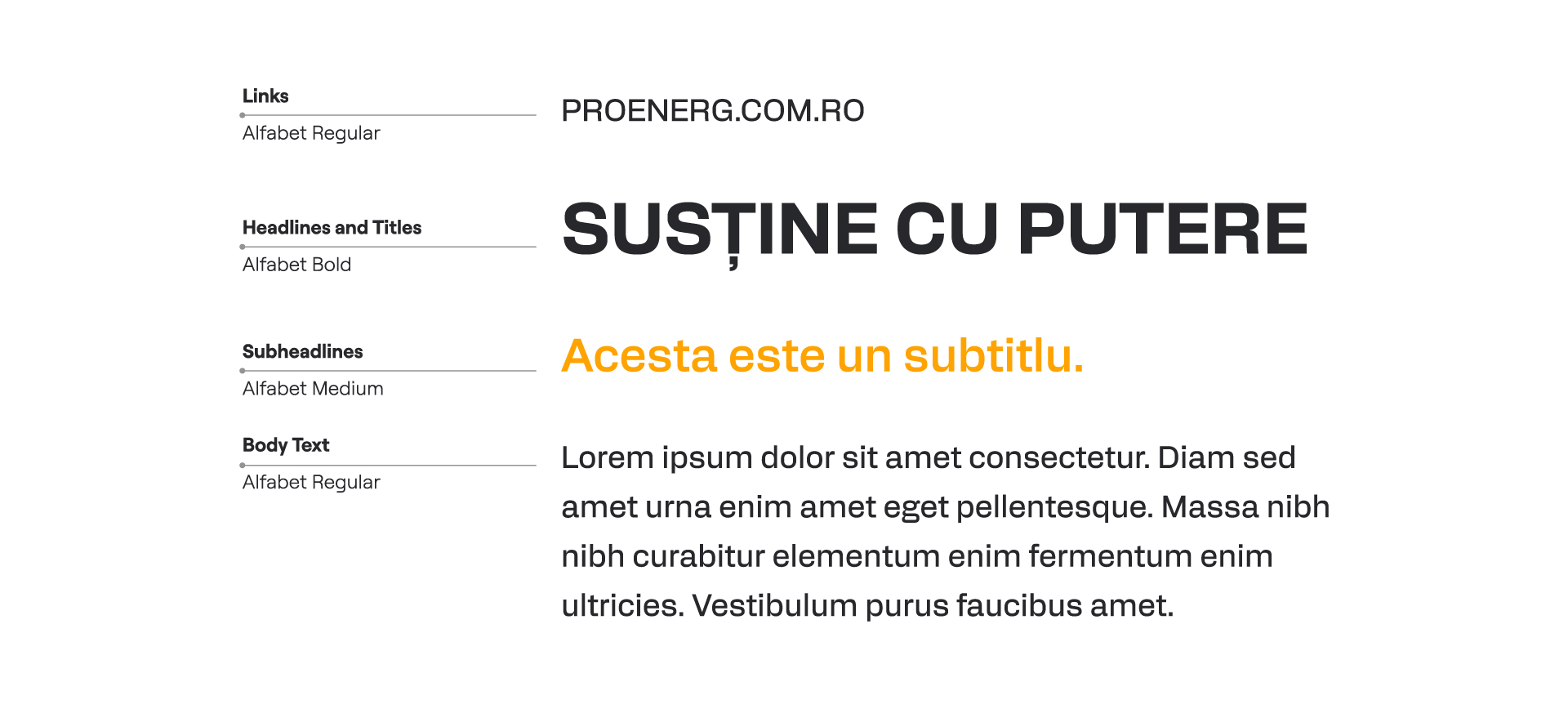
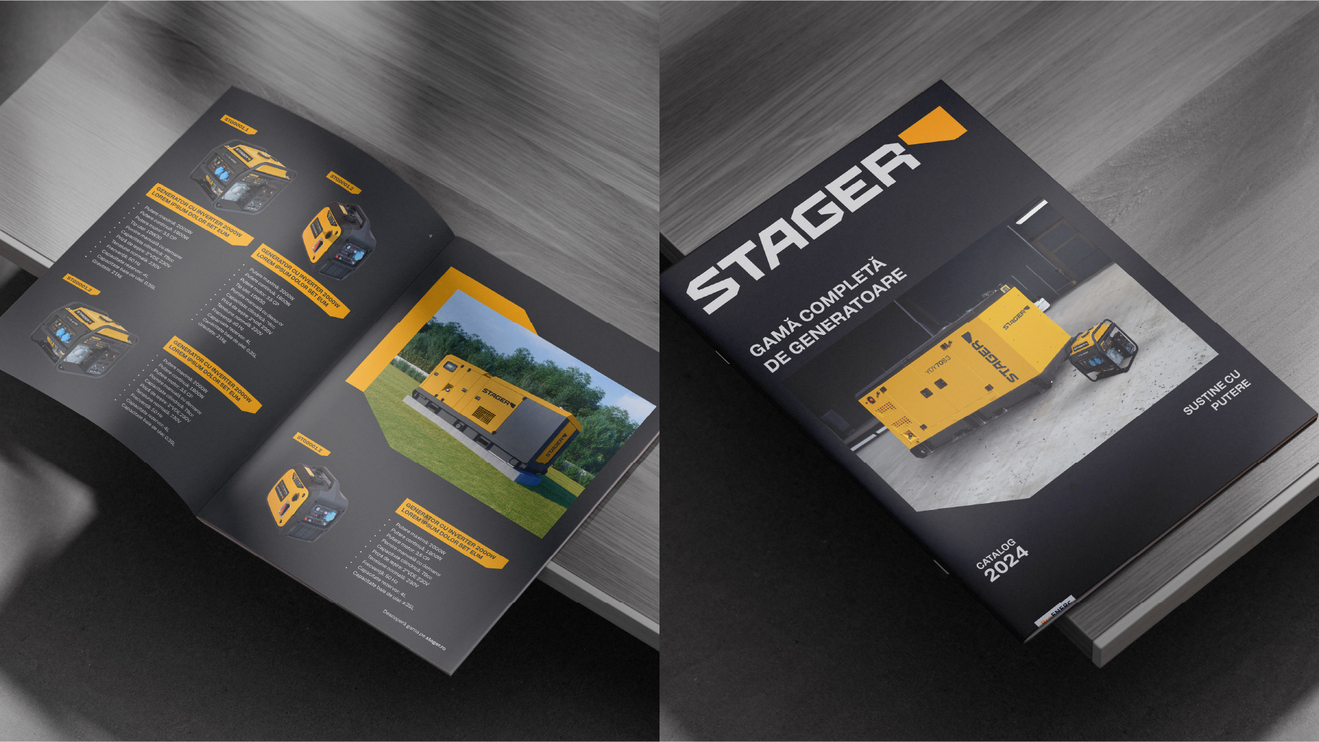
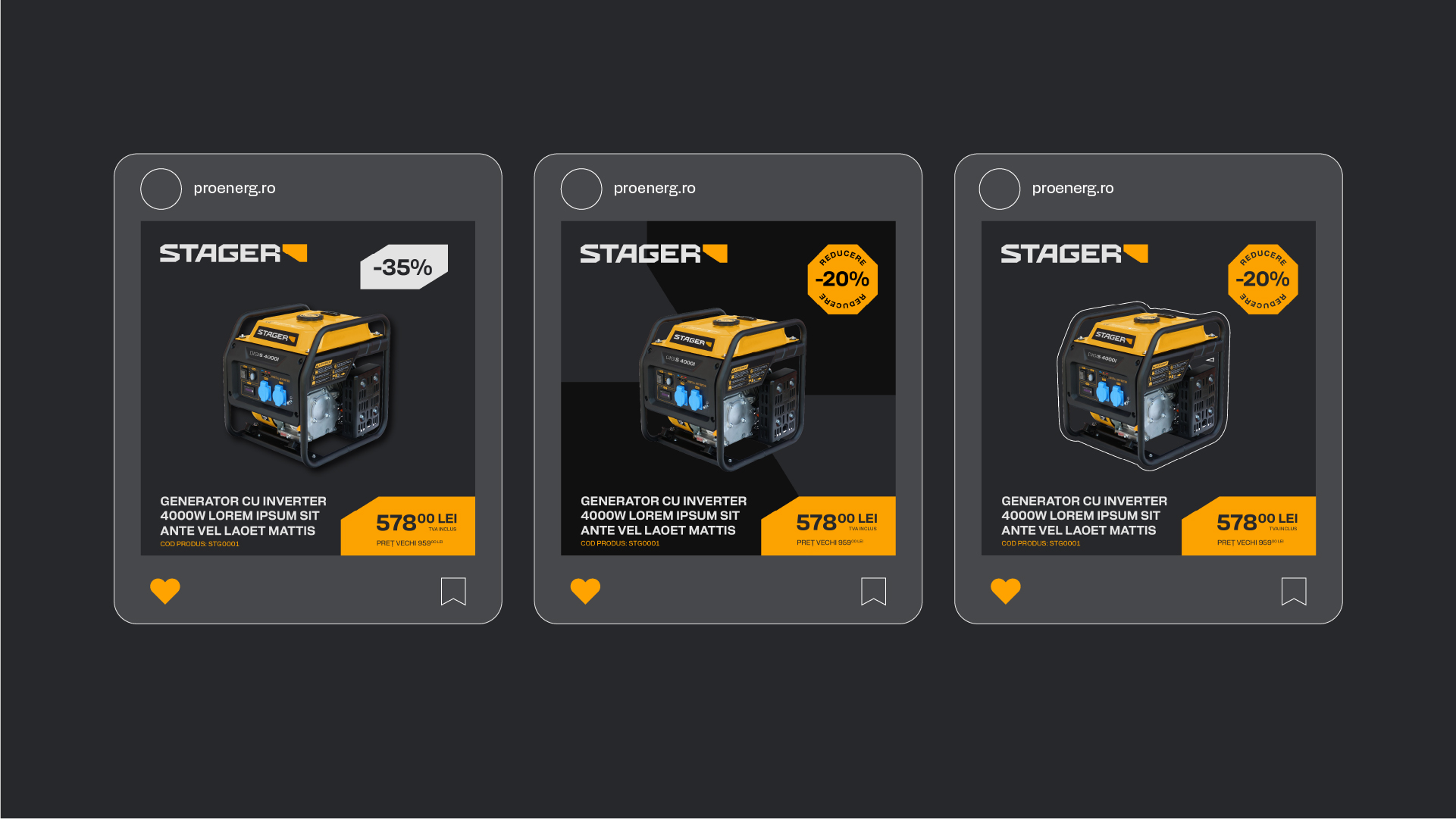
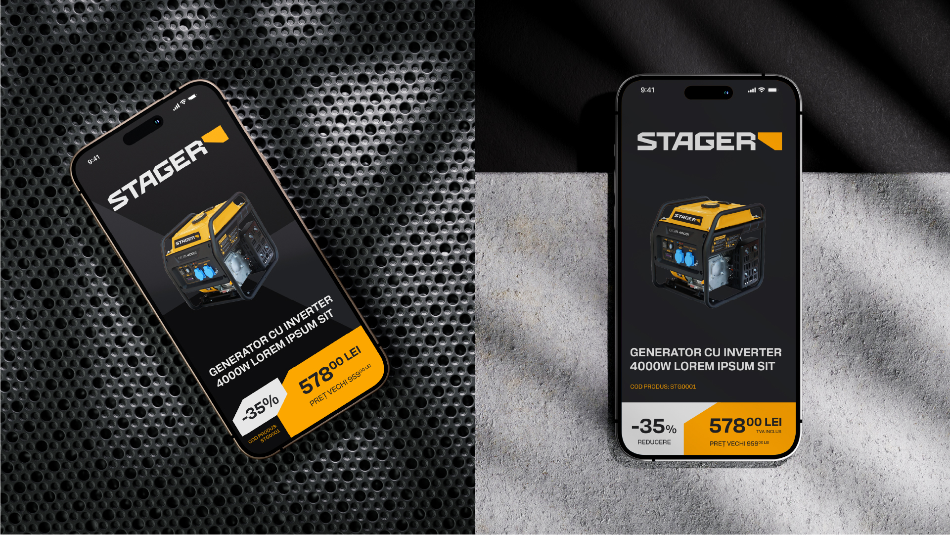
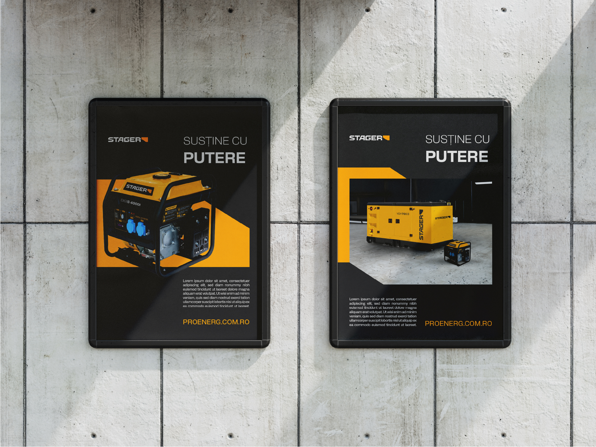
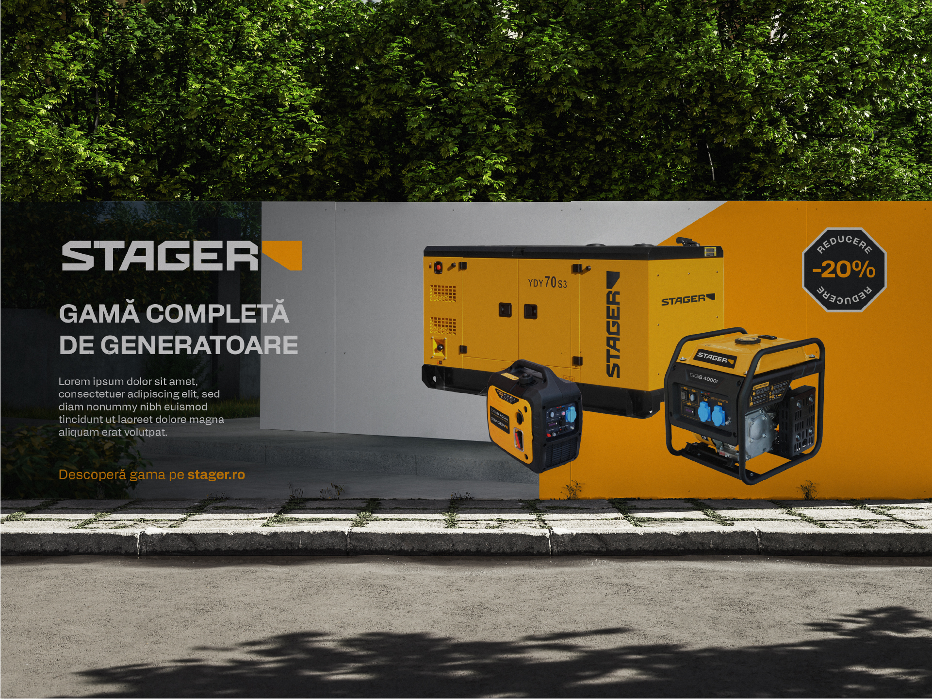
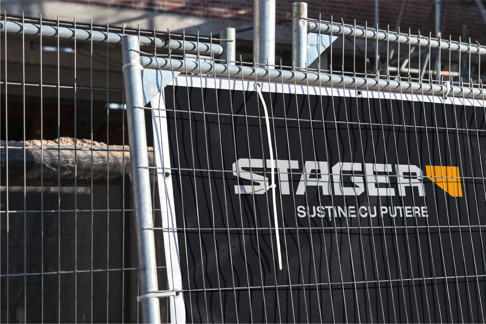
The identity was built around the core ideas of stability, reliability, and utility. We avoided aggressive visual expressions and exaggerated promises, choosing instead a clear, controlled, industrial graphic language that inspires seriousness and robustness. The uppercase wordmark reinforces the perception of strength and consistency, aligned with industry standards but reinterpreted in a cleaner, more contemporary key.
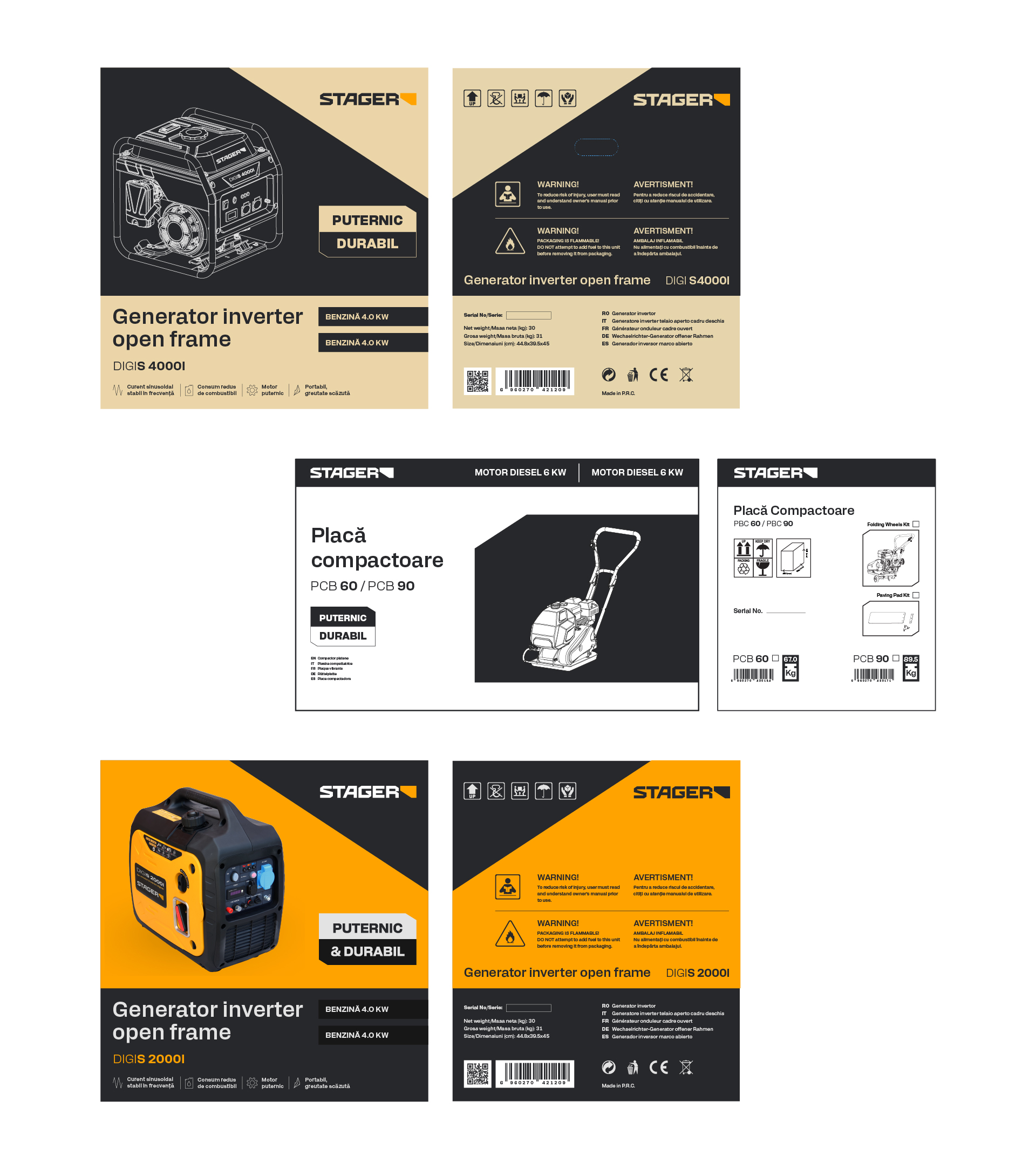
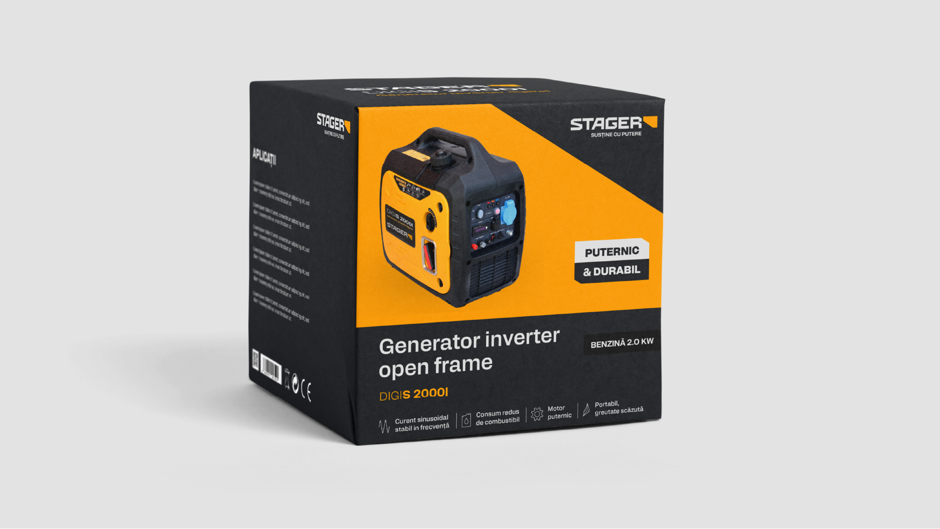
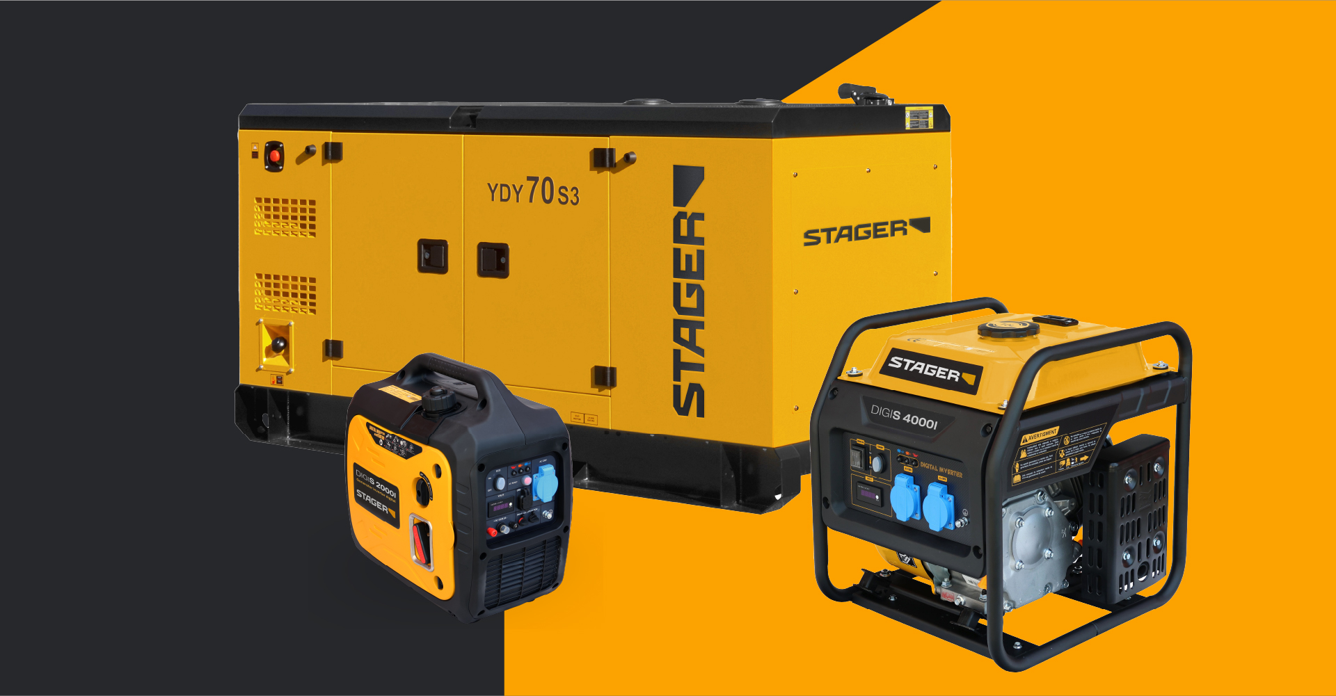
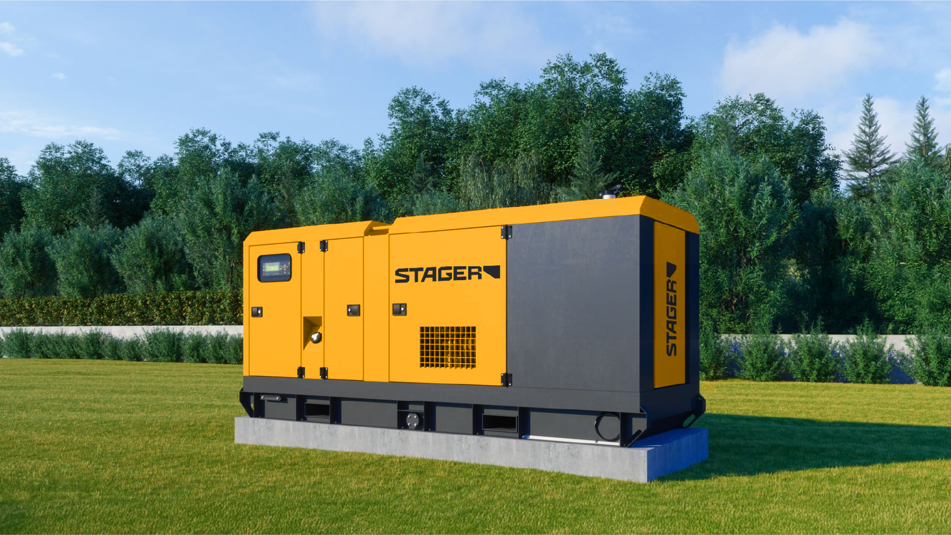
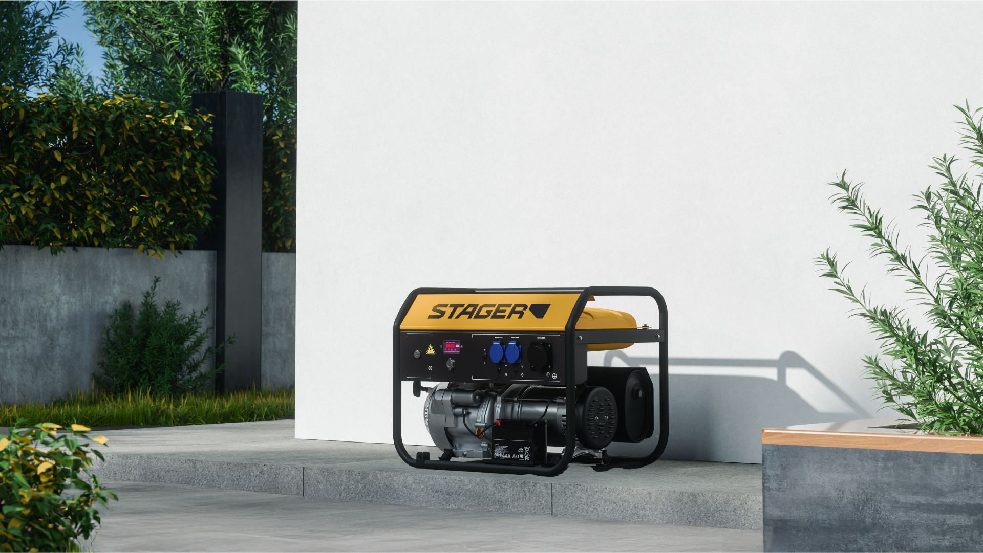
Packaging was redesigned as a tool for communicating quality, rather than a space for visual noise. The format is simple and structured, with an almost technical aesthetic—information is easy to scan, specifications are highlighted, and the design "breathes," inspiring a sense of order. Even in full-color versions, the approach remains minimalist and industrial, building a premium image through visual discipline rather than graphic opulence.
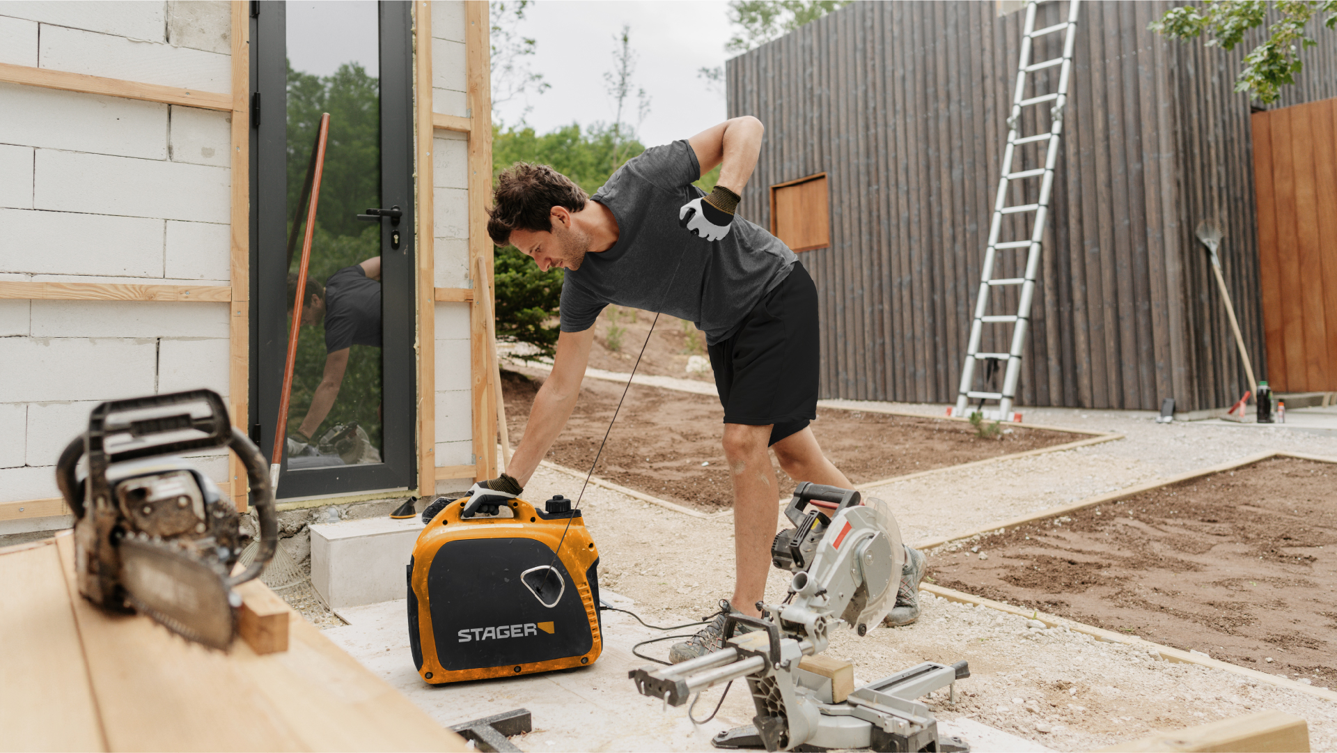
The visual direction is completed by unitized, art-directed imagery that replaces generic catalog aesthetics with a coherent and recognizable style. Consequently, Stager has begun to look and act like a true brand, rather than just a logo applied to a product.
The new identity positions Stager as a solid, stable, and responsible brand that offers more than a tool: it offers continuity, security, and support. It is a brand that doesn't promise the spectacular; it delivers consistently.
Through this refresh, Stager embraces its role as a reliable partner for users seeking honest, durable equipment backed by genuine service. It is a mature brand that speaks of utility, reliability, and long-term value in a category otherwise dominated by noise and superficiality.