Business challenge
The entrepreneurial networking market is saturated with informal communities that promise valuable connections but deliver directionless socializing. Events are plentiful, but results remain difficult to measure and even harder to replicate. More Networking, with ten years of activity behind it, needed an identity that would mark the brand's maturation: from friendly community to professional system, from vague promises to clearly defined numerical goals. The challenge was to build a visual identity that simultaneously reflects the organic nature of human relationships and the rigor of a business system. The brand needed to inspire confidence in the B2B environment, communicate exclusivity without arrogance, and make it clear that strategic networking is different from simple socializing and that it is, in fact, the most effective sales channel.
Branding solution
Starting from the premise that business relationships are organic, they don't appear overnight, don't run on luck, and don't grow when left to chance, we integrated the concept of an ecosystem as the foundation of the entire identity. The roots represent the foundation: trust, reputation, and consistency. The leaves represent growth: visibility, opportunities, and the exchange of value. The continuous flow reflects exactly how strategic networking works, not as an isolated event, but as a constant process of exchange, feedback, and evolution.
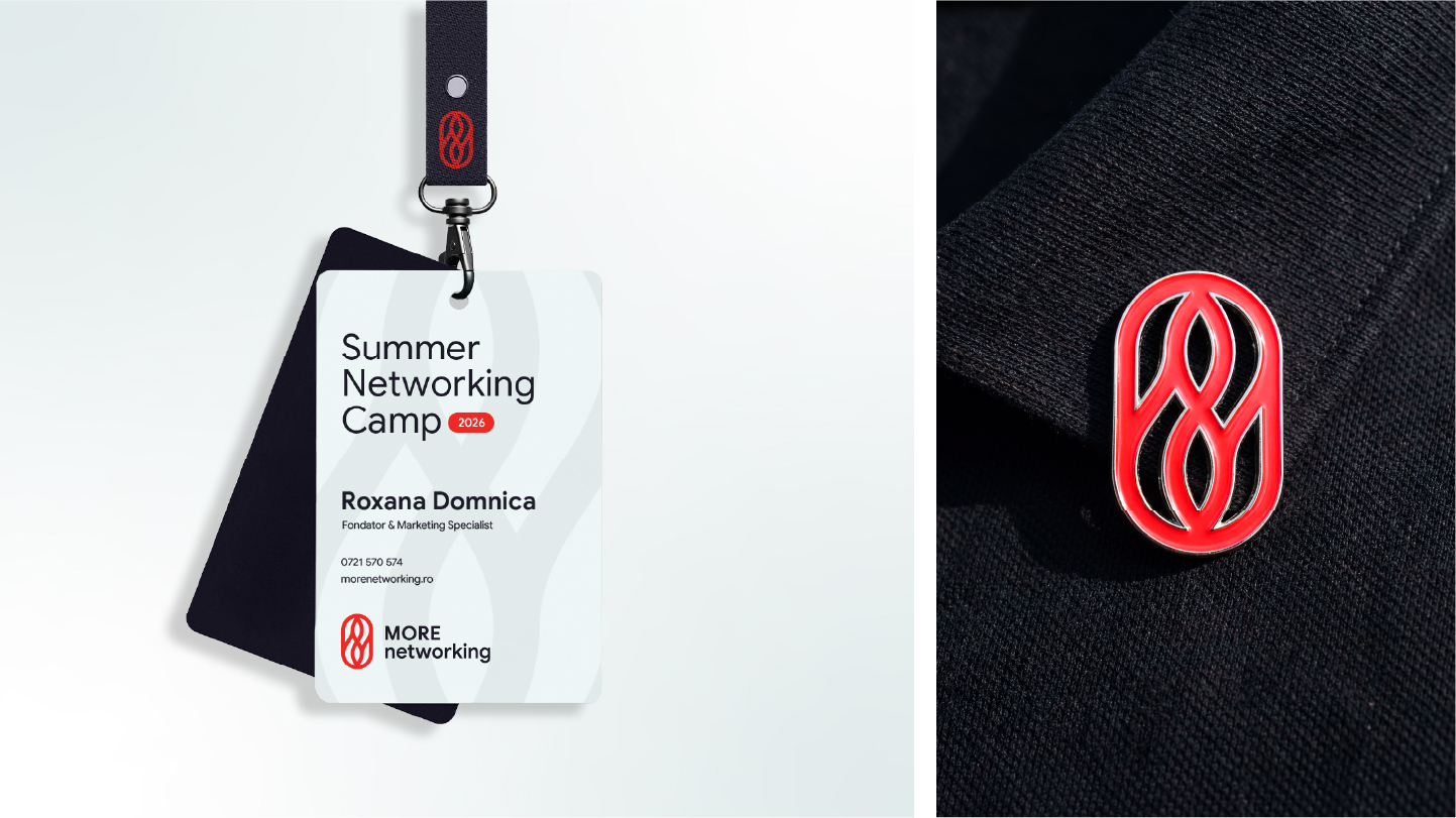
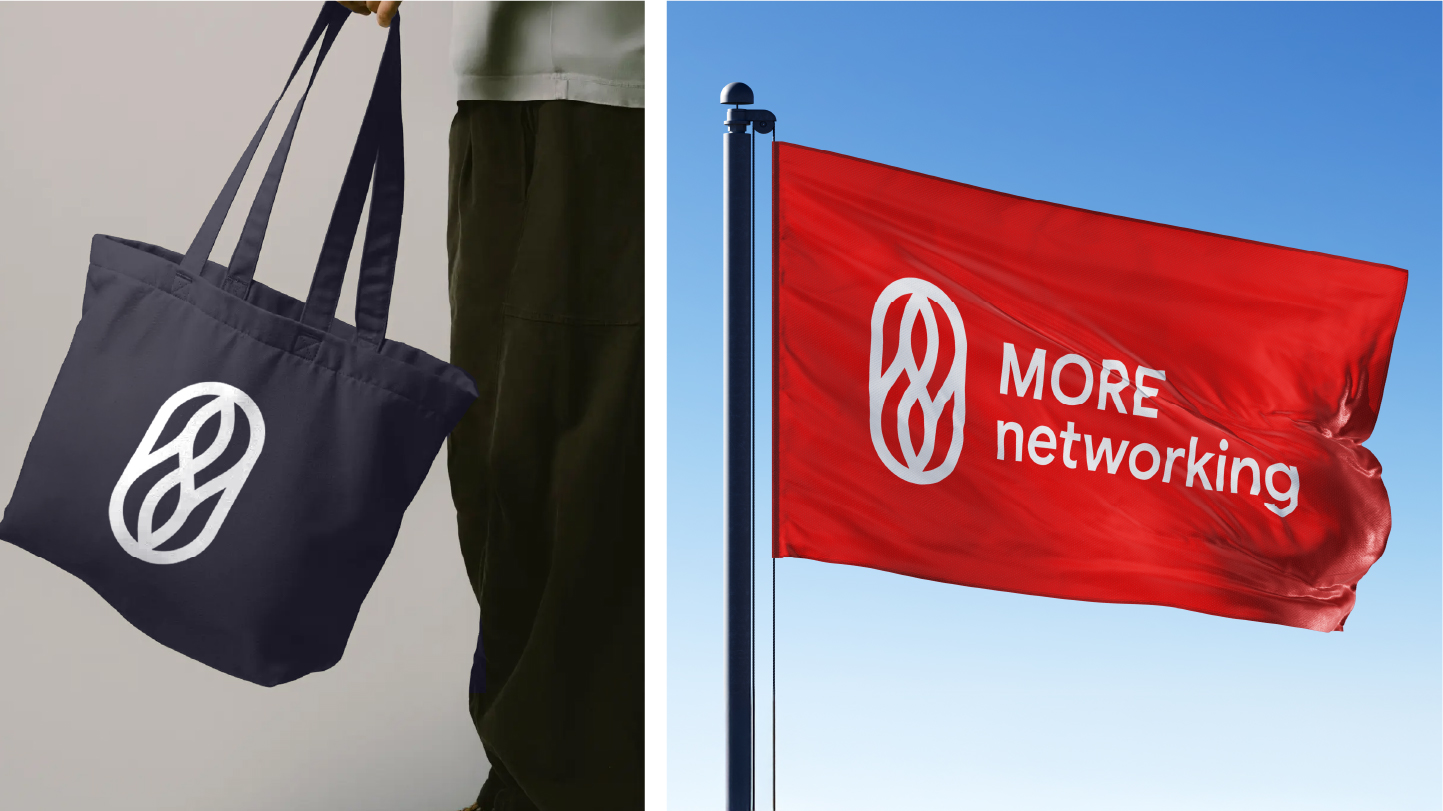
The brand symbol translates this idea into pure form: organic elements inspired by nature, engaged in a continuous exchange, suggesting the transfer of information, value, and trust. The shapes visually reference infinity, since networking is not a one-time action but a skill built over time. The entire symbol is enclosed within a capsule, representing the More Networking community: the structure that makes it possible to maintain relationships, the safe and well-organized framework within which exchange becomes efficient and relevant. At a conceptual level, it is a modern reinterpretation of the handshake from the previous identity, but this is no longer about a gesture, but about a living mechanism of constant growth.
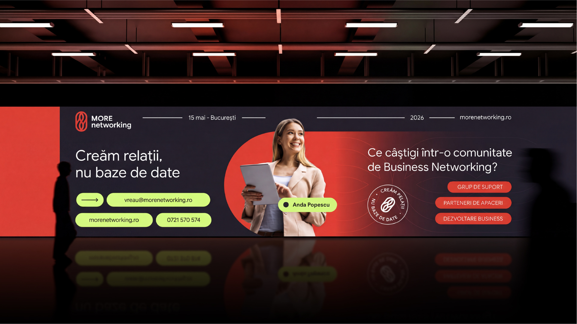
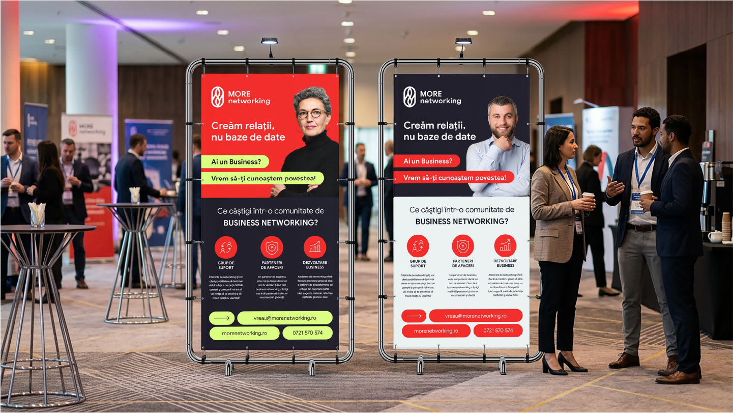
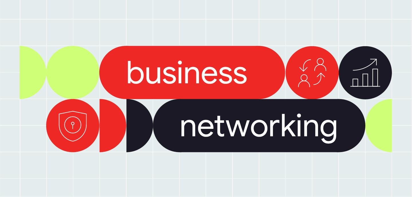
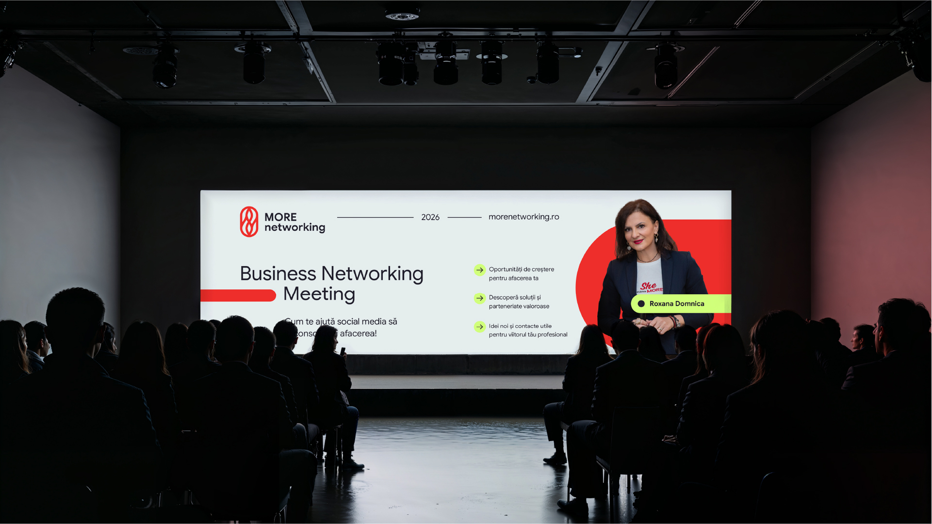
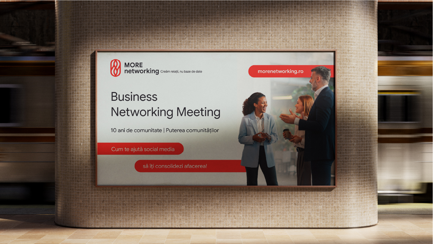
The color palette maintains continuity with the previous brand while bringing it into a more mature and controlled space. Red remains the emotional signature, delivering energy, courage, and dynamism, standing out in a market dominated by neutral tones. White and anthracite gray bring clarity, structure, and professionalism. Lime green accentuates growth, appearing selectively where the message calls for it. The typographic system combines Google Sans, a modern, clear font built for effective digital communication with Quicksand, whose rounded character balances the rigor of the system and reflects the human dimension of the community.
The new identity positions More Networking as the only structured business relationship system in a market dominated by informal communities. Through the balance between the organic and the methodical, between the warmth of human relationships and the precision of a measurable system, More Networking becomes the partner of choice for the entrepreneur who knows that 80% of profit comes from qualified referrals, not cold calls. The brand transforms networking from a social activity into a business skill: clear, consistent, and delivering results in numbers.