Business challenge
The real estate investment market is often perceived as complex, unpredictable, and lacking transparency, with most players communicating either in a highly technical and impersonal way or in an overly commercial tone.In this context, Property Concept needed to address a dual challenge: on one hand, to become more visible in a crowded competitive landscape, and on the other, to differentiate itself through a relevant promise for its two key audiences — investors and homebuyers — supported by an identity that clearly expresses the value it delivers.
Branding solution
The rebranding process began with a strategic exploration phase, where we analyzed the business, the market, and the real needs of its clients. We worked closely with the founder and team to uncover what truly differentiates the company beyond its services — its way of working, its relationship with clients, and the impact it creates.
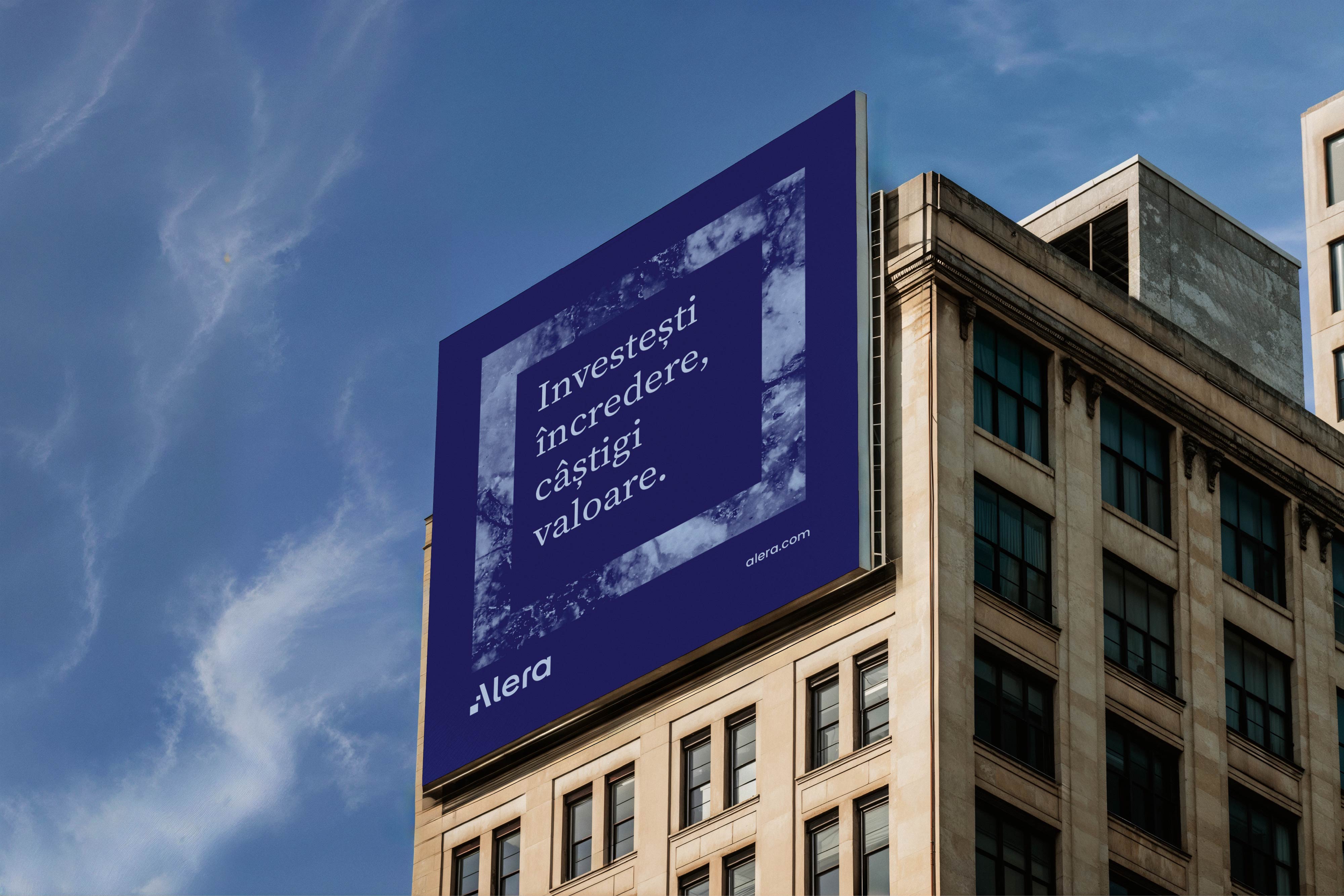
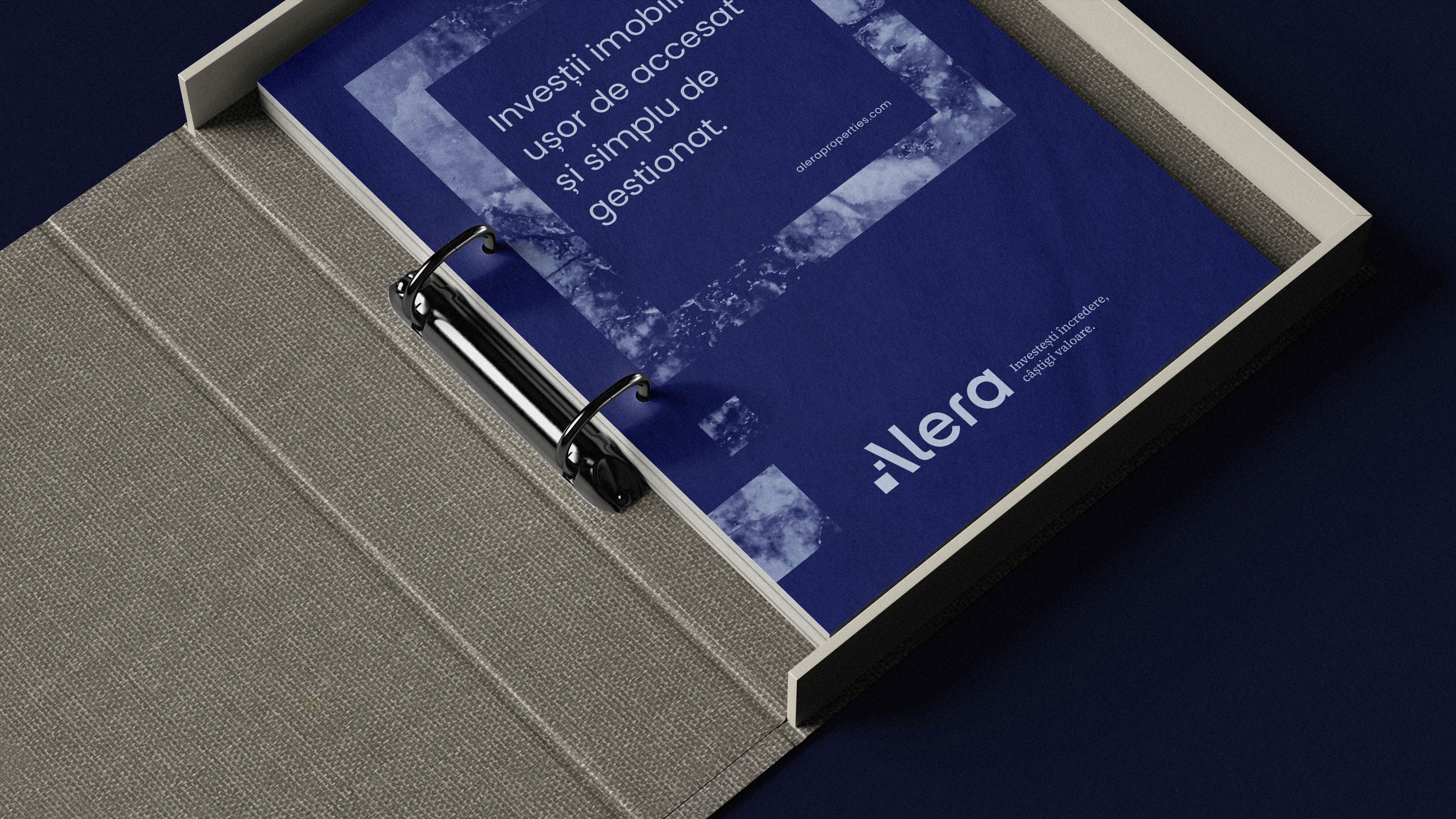
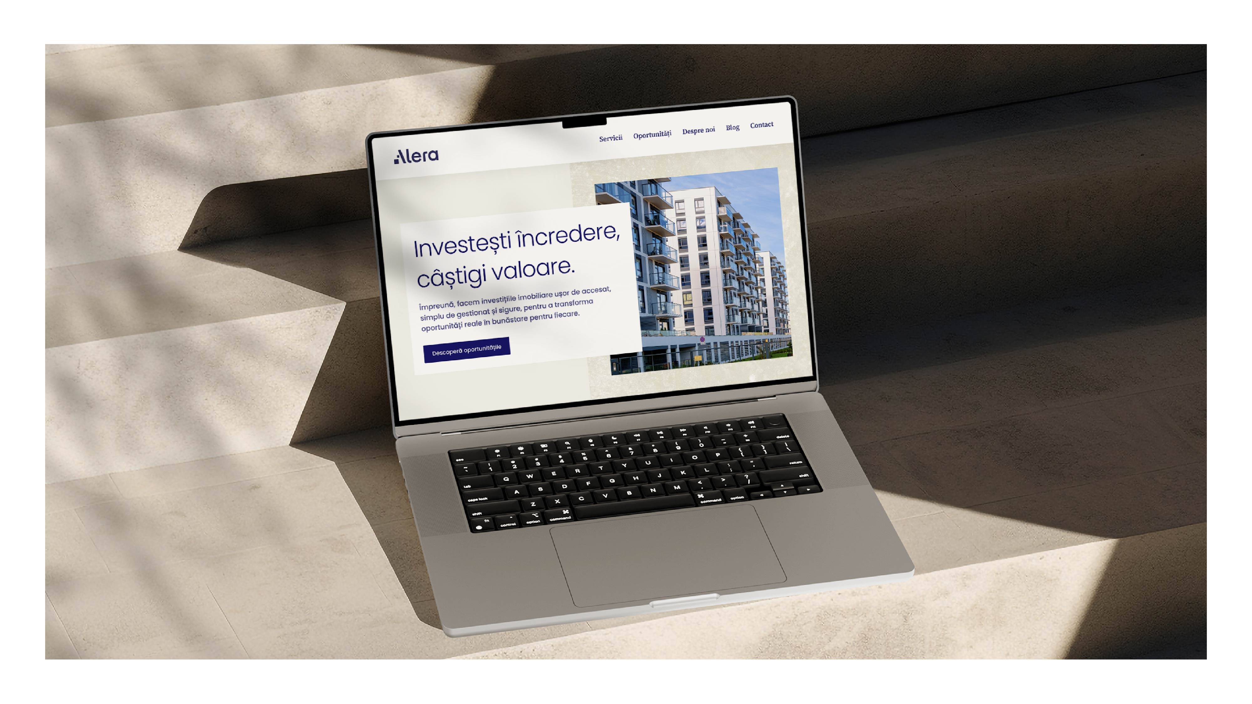
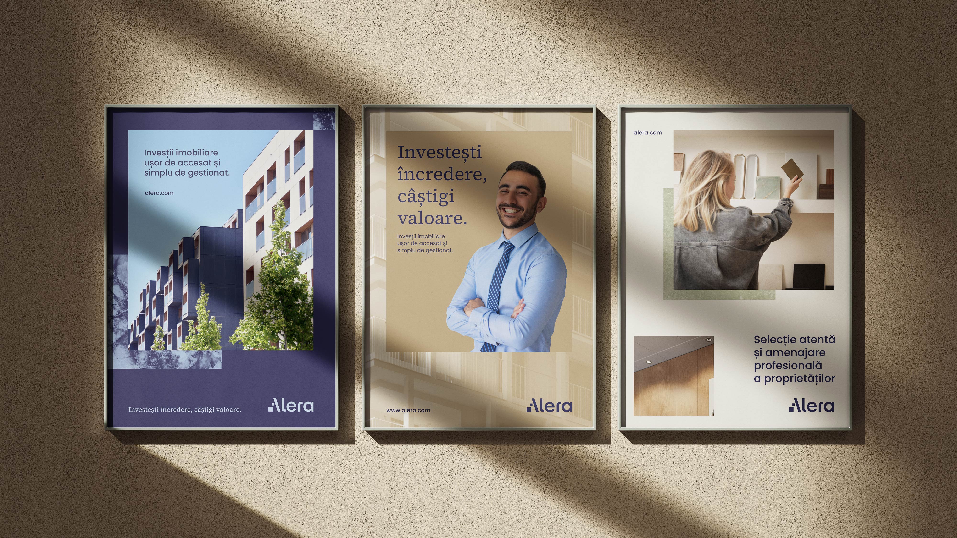
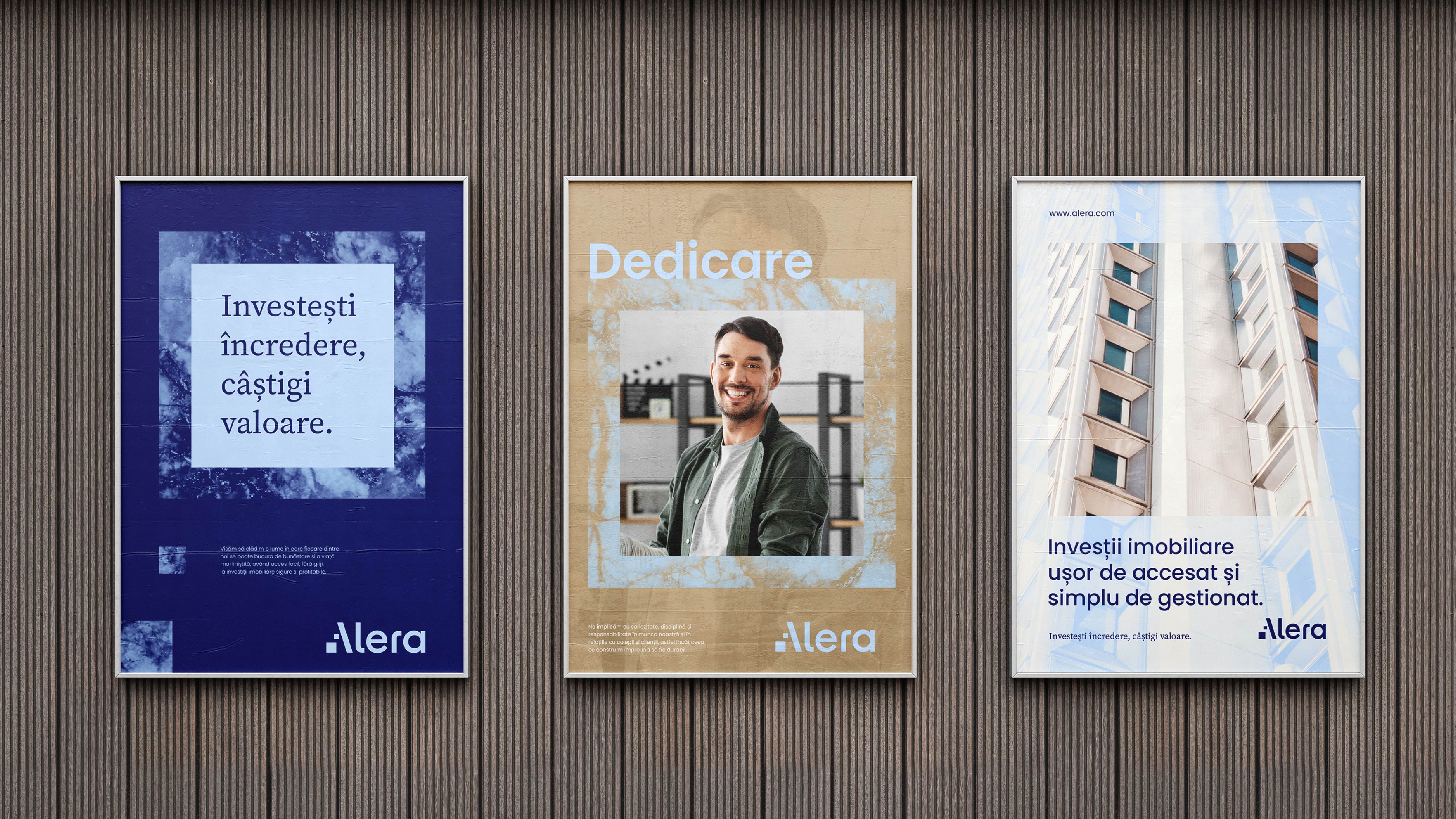
The brand positioning was built around the role the company already fulfills: a partner that transforms a complex process into a clear, safe, and predictable experience, delivering both tangible results and emotional comfort. This idea was distilled into the brand tagline:“Invest trust, gain value”.
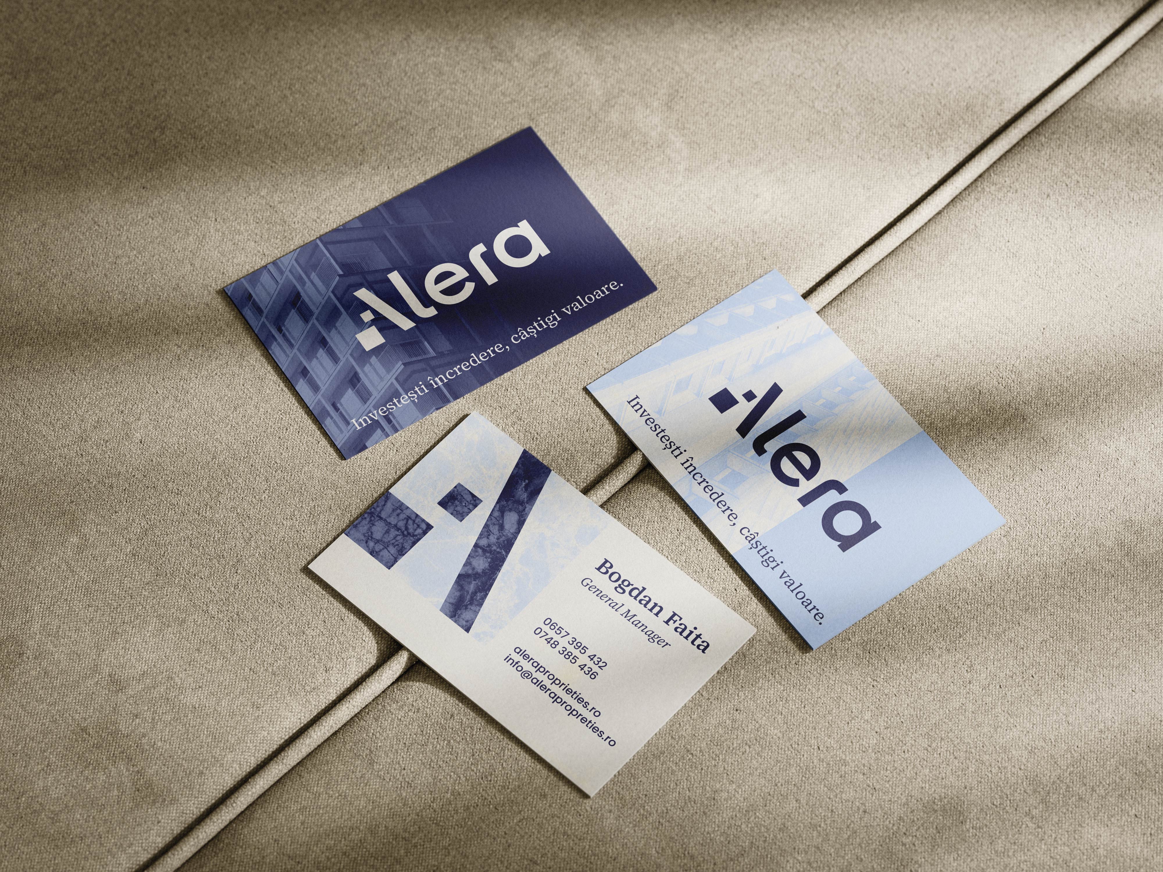
Inspired by the brand purpose — helping people with opportunities to democratize access to welfare — we created the name Alera, derived from the Latin “alere”, meaning “to nurture, support, and help grow.”
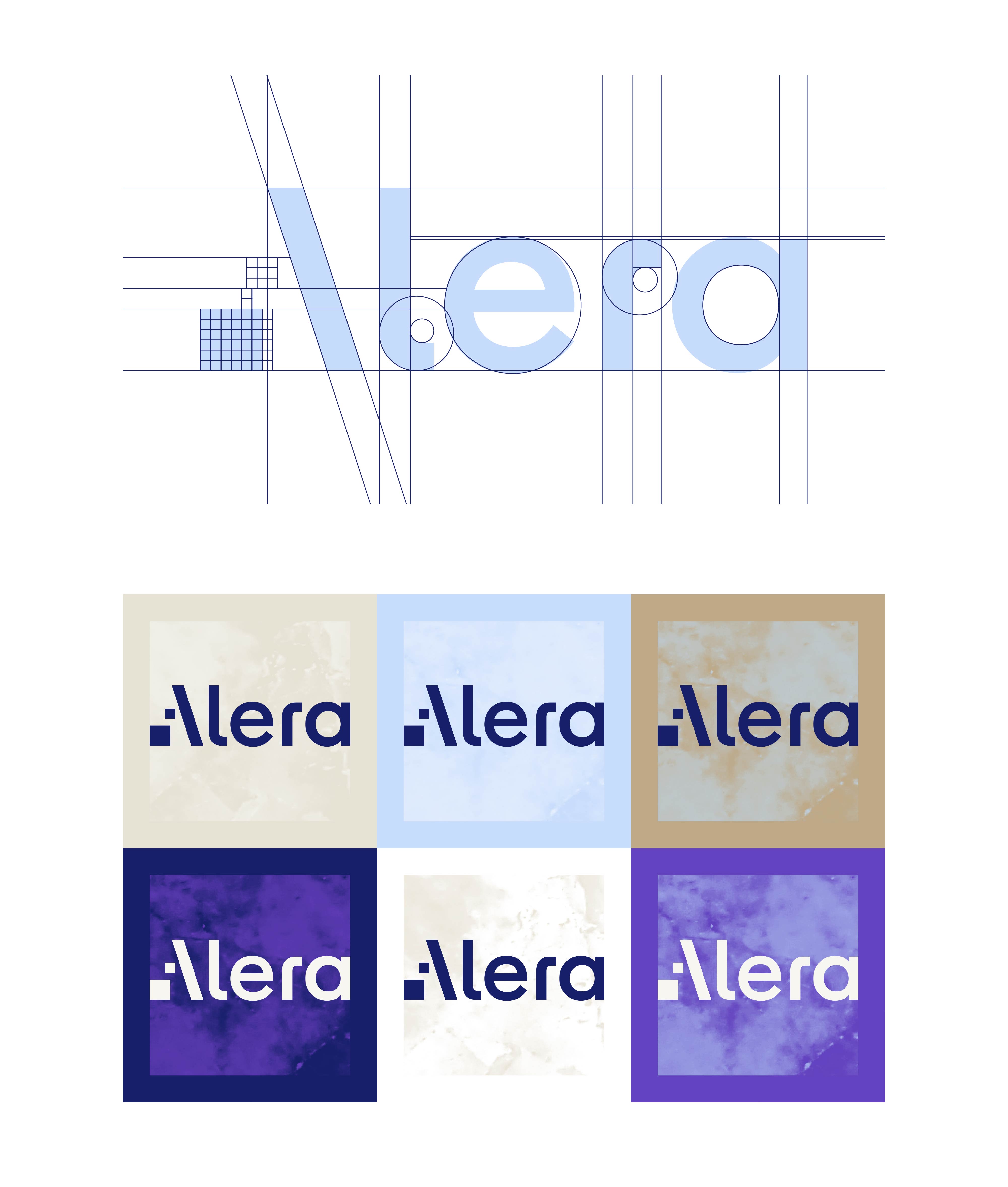
The visual identity reinforces this strategic direction and the meaning of the name, using the “stepping stone” concept to express the idea that welfare is built intentionally, on solid basis and with a long-term perspective — with Alera as the foundation that helps people move forward toward this goal.
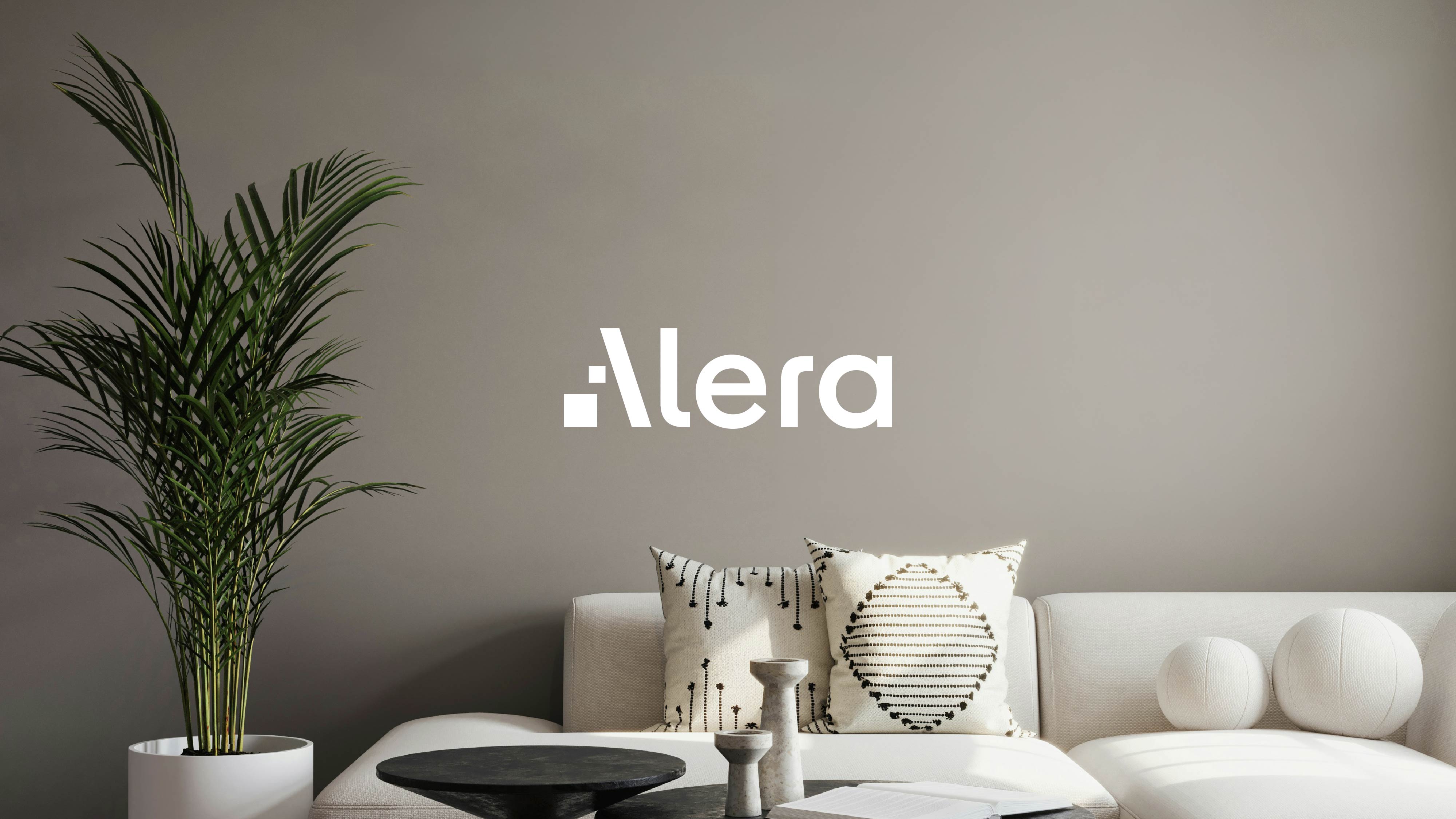
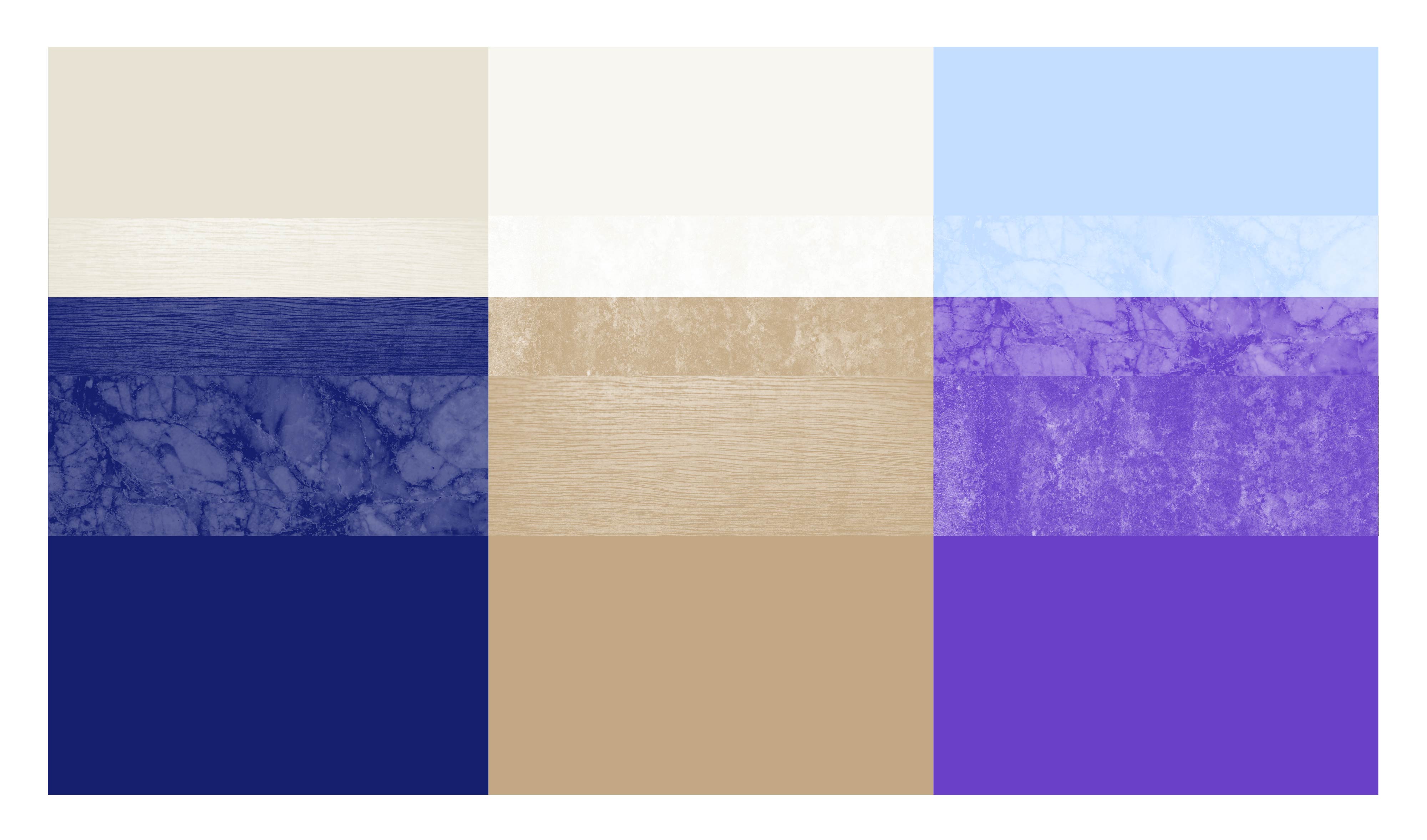
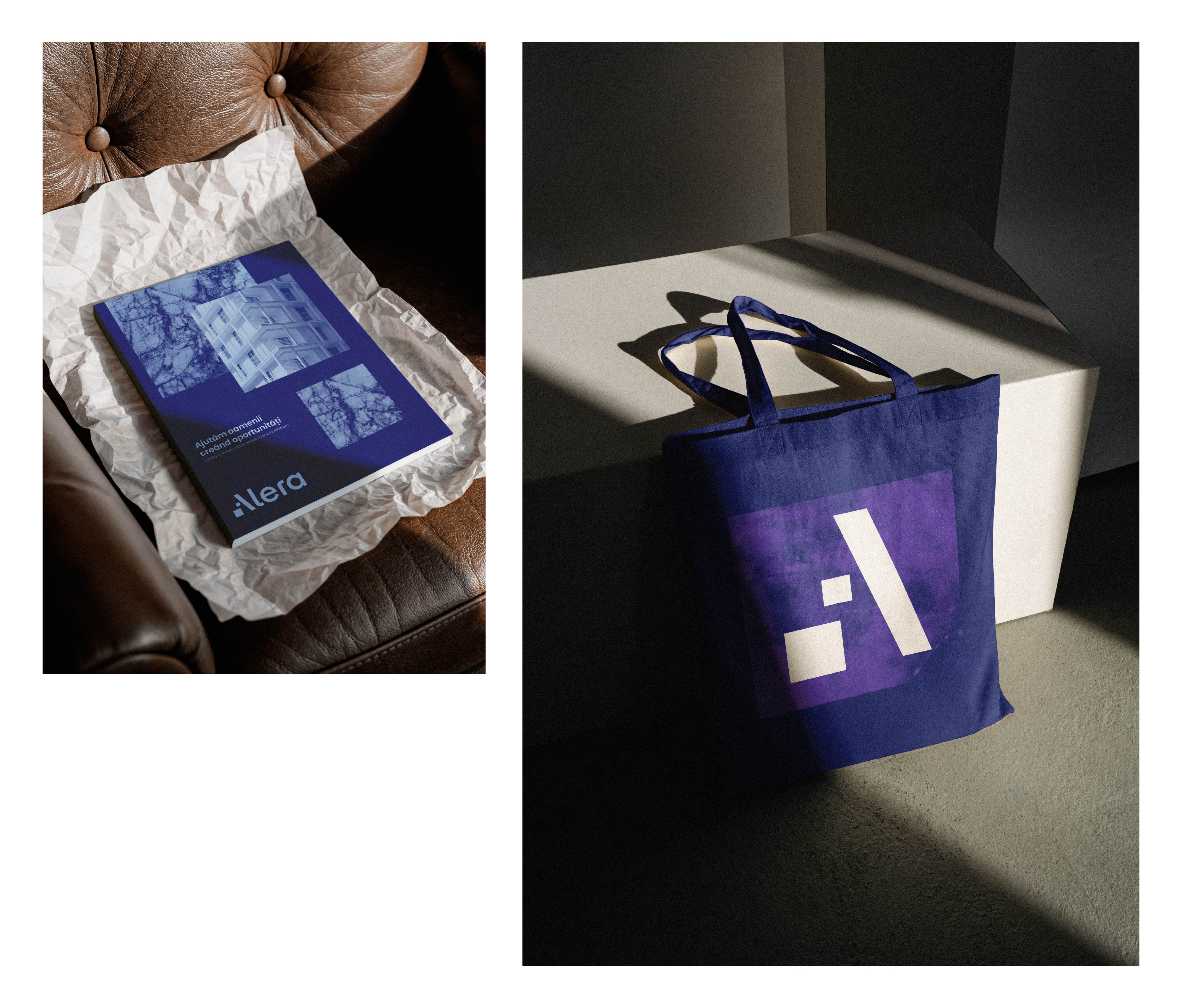
The logo is a carefully constructed geometric wordmark that balances rigor and accessibility. The fact that its initial can function as a standalone symbol of stability and progress enhances its memorability and strength. The visual language is further enriched through a creative combination of colors and textures inspired by the world of interior design, ensuring both distinctiveness and strong relevance within the real estate category.
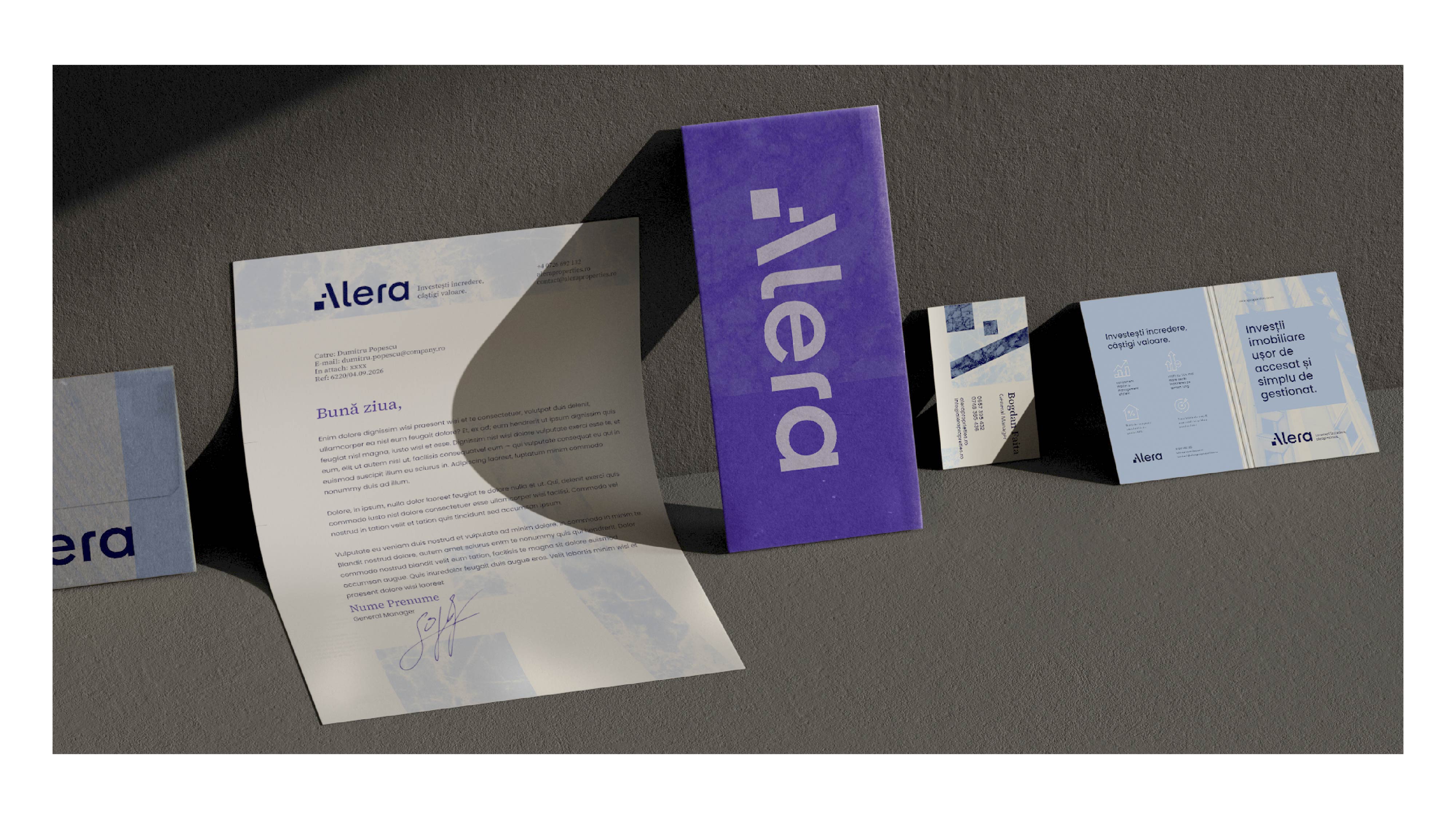
To enable a smooth transition to the new brand and ensure consistent implementation across all touchpoints, we defined the tone of voice and illustrated it through multiple message scenarios, while also developing design templates for key communication materials and channels — from website and social media to office branding.